
Connect with Aliento Studio
What Colour Actually Does in a Recovery Space
Colour isn't the last decision on a project. It's one of the first things a body responds to, and there's a genuine, growing evidence base behind that, not just design tradition.
The Center for Health Design, the body behind evidence-based design in healthcare, defines the whole discipline around one idea: base decisions on the best available research, then track whether they actually work. Colour sits inside that discipline properly. A broad literature review of the field found colour choices in healthcare settings are linked to fewer medical errors, better patient sleep, shorter length of stay, less disorientation, and higher morale among staff, not just a nicer-looking room.
The clearest example
An emergency department in southern Sweden, serving 125,000 people, was redesigned using evidence-based methods, light and colour included. Using a validated before-and-after questionnaire, patients and family members reported genuinely better support from the environment once the changes were in. That's not a design blog's opinion. hat's a measured, peer-reviewed result.
Greens, and the case for looking at nature
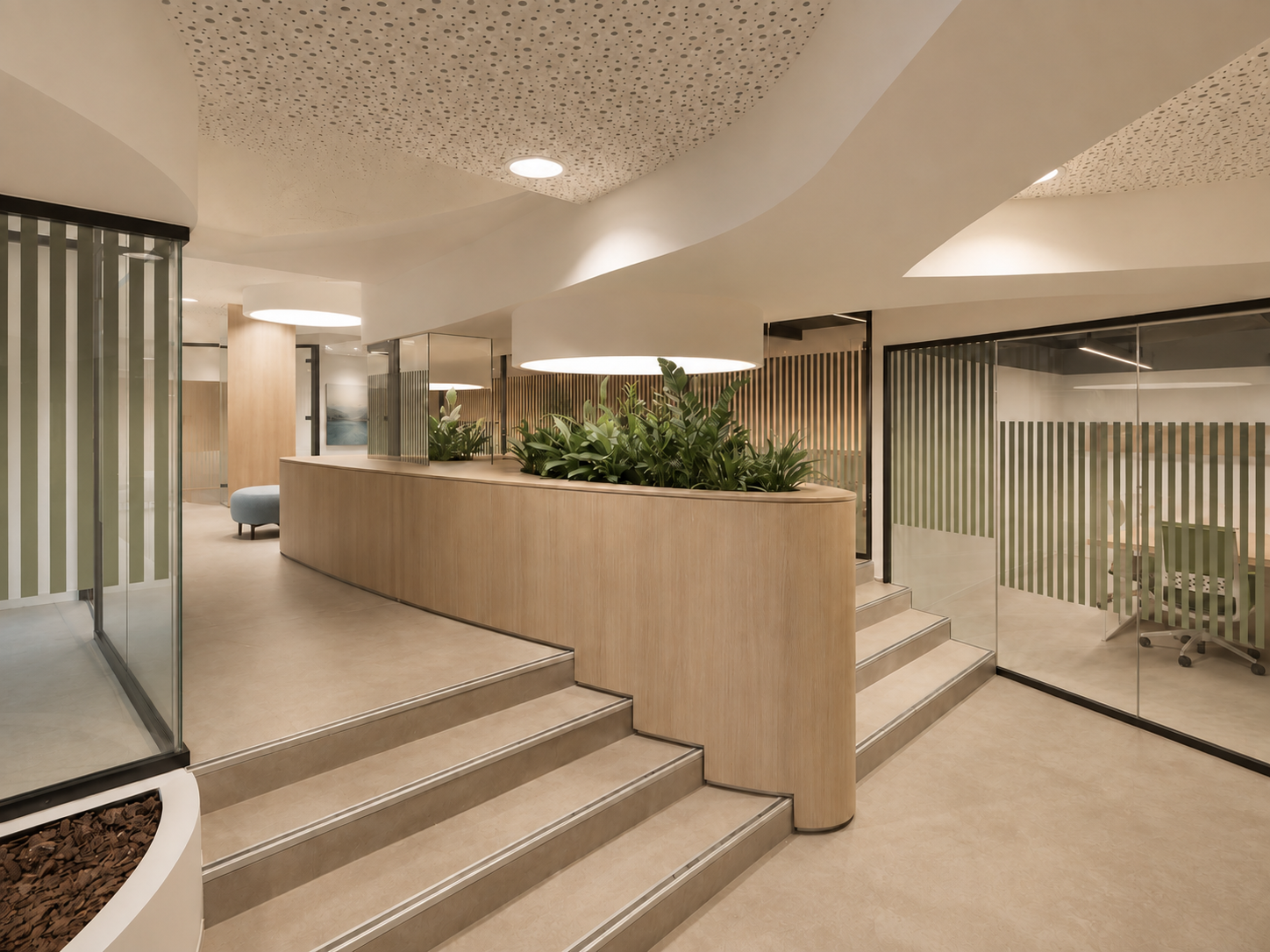
Green sits at the point in the visible spectrum the eye processes with least effort, part of why it reads as restful rather than stimulating, and it's the colour most tied to the natural world. In a recovery ward or a staff breakout space, that's not decoration, it's doing a job.
Blue, used with intent rather than by default
Blue is the colour most associated with calm and trust in healthcare design, and it's also the most overused. One considered application, a feature wall, a wayfinding system, still earns its place. Blue everywhere stops calming and starts reading as generic.
Warm neutrals
Sand, stone, warm greige, muted clay. These sit between sterile and stimulating, grounding a space without tipping it toward anything trend-led.
What to leave out, and the one exception
Saturated red and bright orange raise alertness, useful in a gym, wrong wherever the goal is to bring someone's system down. The clear exception is paediatric spaces, where bright, engaged colour does a different job entirely, working through stimulation rather than calm.
Worth being honest about
This is a genuinely growing field, not a settled science. Researchers in evidence-based design are open that colour strategy needs more rigorous study before every specific claim can be called proven. What's consistent, across every study, is the direction: colour affects people in these spaces, patients and staff both, and treating it as an afterthought is the one option the evidence doesn't support.
Let's talk about your space
Tell us a little about the project, a courtyard, a waiting area, a spa or clinic interior, and what you're hoping to change. We'll come back to you to talk it through, no obligation.